
Like A Rainbow: Farrow & Ball’s latest colors are showcased in their new LA store
Author:Abigail Stone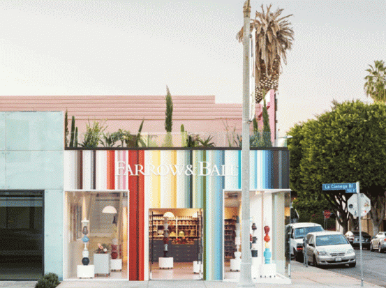
British paint and wallpaper company Farrow & Ball, whose color range and prints draw from historic palettes and archives, is lauded for the extraordinary depth of their pigments. Although the names of their colors — Elephant’s Breath, Dead Salmon, Calamine, Skimming Stone and Cabbage White, to name a few — infer a wry sense of humor, the evocative names also speak to the precision the 72 year old company brings to their work. Their wallpaper uses traditional methods like block and trough printing and their own paints are water-based paints and eco-friendly, down to the recyclable cans. Rooted in the past yet forward-thinking, their latest colors, as well as the design of their newest store located in the heart of Los Angeles’s design district, upholds their dedicaiton to the importance of color in highlighting a space’s best qualities.
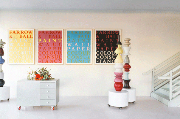
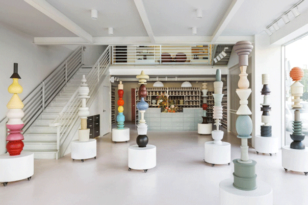
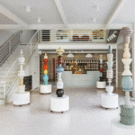
The vibrant, striped façade of the new showroom showcases the brand’s full rainbow of colors. Inside, a series of striking painted-wood scupltures are more than just decorative; they demonstrate how the colors look on furniture. A magnetic system, developed by interior designers Isaac Resnikoff and Sandy Yum of Project Room, consisting of walllpaper, trim pieces and swatches, in all 132 colors and the full range of finishes, offers customers a tactile and playful approach to choosing their ideal color scheme.
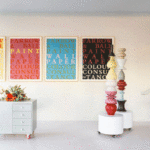
We sat down with Charlotte Cosby, Head of Creative at Farrow & Ball, to take about their new hues, a suite of nine colors, inclduing Rangwali No.296 – an exotic pink inspired by the powder used at the Holi festival in India – Bancha No.298, a soothing shade of green named after Japanese tea leaves that provides a feeling of safety and security – and Jitney No.293, a relaxed and sandy neutral, which takes its name from the bus that whisks New Yorkers to the Hamptons.
These colors take on more natural and jewel tones. What inspired this direction?
When developing new colours, we speak to our global colour consultants and showrooms and analyse our existing colour card to identify any gaps in the palette. We also look at long term decorating, social and economic trends to help us choose the right colours to add to our edited collection.
Which colors are enhancements of existing popular shades?
School House White No. 291 is the lightest in colour, and in the group including Shadow White, Shaded White and Drop Cloth – each created to look like white when used in deep shade. Treron No. 292 is a dark green version of our classic Pigeon. And Jitney No. 293, an earthy colour, sits between Oxford Stone and Elephant’s Breath.
Which colors in the collection have received the greatest response?
When we develop new colours, we conduct a lot of research to ensure each colour earns its place on our colour card. Because we maintain our core collection of 132 colours, there really is something for everyone. Some people are drawn to more neutrals like School House White, while others go bold with Paean Black or Bancha.
Do you feel these colors will inspire new trends in the industry?
We hope our stronger colours will encourage people to make increasingly bold decisions. For example, painting an alcove, piece of furniture, one wall or trim can be a great way to introduce a stronger colour without feeling overwhelmed. If you are confident with colour, Preference Red is our ‘colour of the moment’, it’s our richest, deepest red and looks amazing teamed with gold, Paean Black or Hague Blue.
Which color is your favorite and why?
Rangwali is our friendliest colour, welcoming, vibrant and adventurous. My favourite uses for this hue are the front door, hallways, exteriors and the underside of free standing baths. It looks spectacular with Vardo, Downpipe and All White!
Farrow & Ball Los Angeles, 741 N La Cienega Blvd. West Hollywood, CA 90069
