
A Second Chance
Author:Lindsey ShookMichael Hilal revives a historic San Francisco home with color and innovation
“We looked to London townhouses for the design as they have nailed how to renovate historic properties in a way that feels more modern yet celebrates the original elements of the home,” recalls San Francisco designer Michael Hilal about the inspiration behind the redesign of a historic Pacific Heights home owned by a retired couple whose primary residence is in Vermont. “In the U.S. I find that when renovating historic spaces we either gut the home completely and keep the classic shell and move in a very contemporary direction on the inside or we try to replicate the details of the home to the point that it looks a little like a movie set,” he notes. “The goal here was to find that balance.” Built in the late 1800s, the 4,800-square-foot home needed a modernized floor plan that would create larger communal spaces while also brightening each room. “There are several formal areas in the home and the client does not live like that,” Hilal says. “What became the sitting room and eat-in kitchen area was a massive formal dining room with a powder room off of the side of it. We moved the powder room under the stairs [in the entrance] and completely opened up the kitchen to the sitting and dining area.”
Doused in Farrow and Ball’s Parma Gray, the kitchen cabinets present a cooling blue hue that is both soothing and grounding. “I’ve been wanting to design powder blue cabinets for some time,” he says. “I speculate that a dull blue/powder blue is going to be the It color in the next few years.” On top, Hilal selected a dramatic Breccia Viola marble for the countertops that adds warmth and contrast. “Colors really need transitions,” says Hilal. “You really want a stone that has variations that shift from cool to warm, which seems contrary, but it really works in providing soft transitions in a space and makes the atmosphere feel more calming. I walk into so many kitchens with white or navy cabinets with this stark white stone or just white and gray and it’s so safe and boring.”
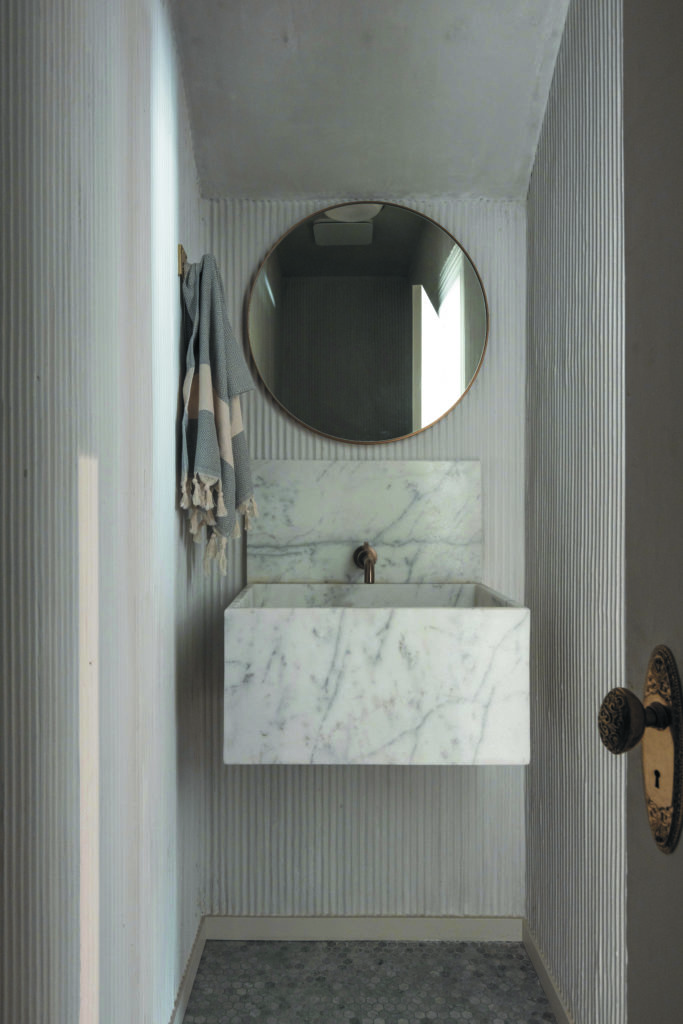
Under the stairs just past the kitchen sits the newly configured powder room, which is wrapped in a fluted stucco wall. “We purchased a really great product from Texston—patterned application wall boards that you plaster over,” he notes. “Admittingly, it was a pain to install because the plaster artist was in such a confined space and the time commitment to apply the plaster evenly really took days, but the outcome was fantastic; it really stands out.”
When the project was finally complete, Hilal walked his clients through the home that he gave a second life to and recalls, “They had a lot of renewed love for the home where they raised their family. Aside from memories, they were in awe of seeing how they should have lived in the space all of those years ago.”