Beautiful Like a Rainbow
Author:Abigail StoneDee Murphy proves her colorful approach to design will make a lasting impression
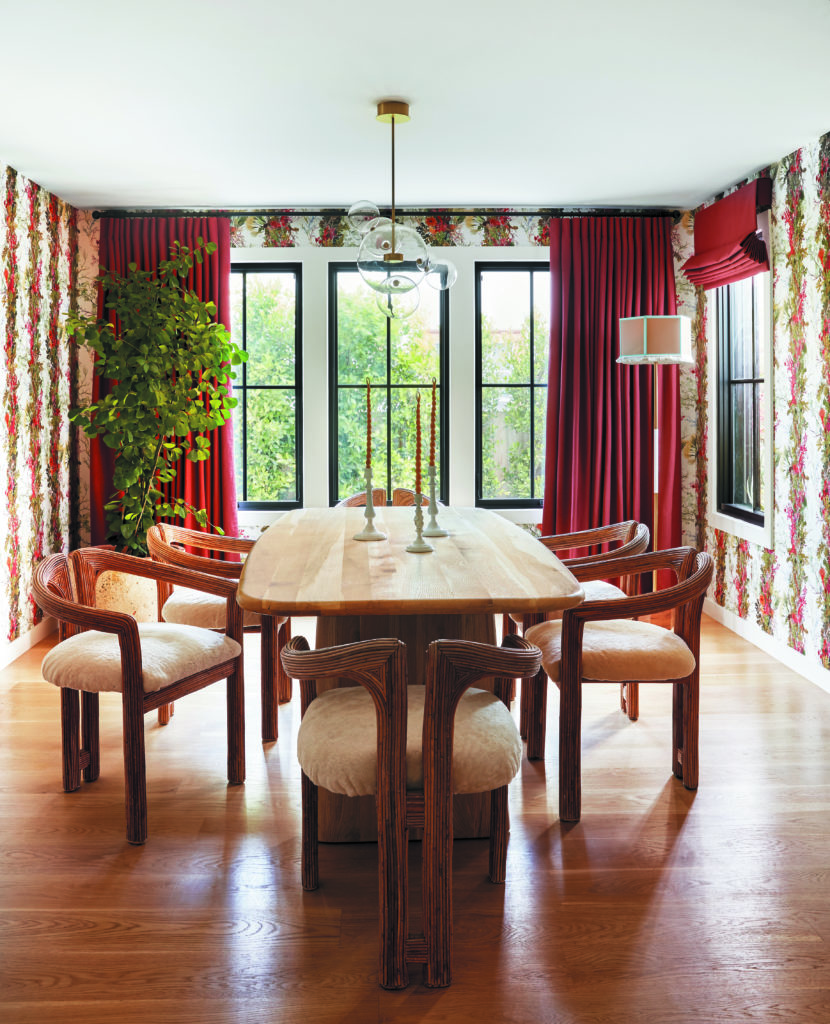
The starting point for a home’s design is often sparked by a single object that coalesces an interior designer’s vision. In the case of this Larchmont Village bungalow, courtesy of Dee Murphy, the dining room’s striking wallpaper—Timorous Beasties’ Seaweed Column—orchestrated its vibrant color scheme and festive mood. “When you see how these rooms connect,” says Murphy, pointing out how everything on the first floor radiates out from the dining space, “You realize how much it all makes sense.”
Murphy, known for her fearless use of color, found the perfect comrades in her clients, recent transplants from New York who embraced Los Angeles’ brightness. “They’re so creative and fun and open,” Murphy says. “They love reds, orange, blue and chartreuse.” Still, she was surprised they championed the bold design. Perhaps coincidentally, the wallpaper picks up the flower-filled greenery in the garden, tying the inside to the outside. Intricately carved wooden chairs soften the impact of the bold walls. “Vintage adds immediate warmth and texture to a space,” says Murphy, sharing one of her guidelines for working with strong hues. The softness of the chairs’ seats nod to the velvety texture of the wallpaper.
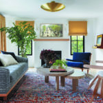
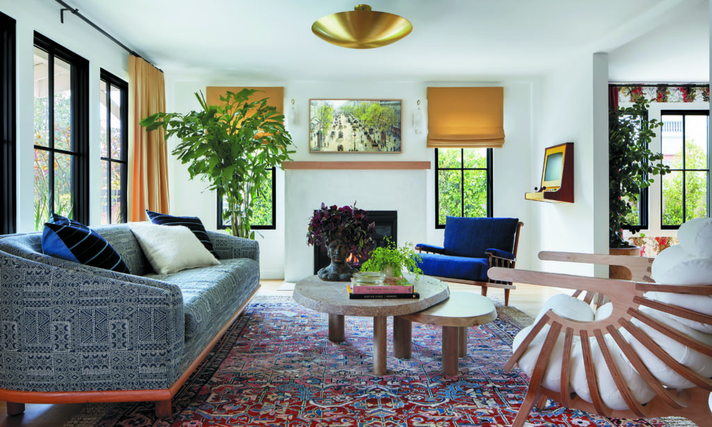
A clean-lined bar cart, washed in a rich cobalt blue taken from the wallpaper, is the obvious connection between this room and the formal living room beyond one archway; the hue is mirrored in the plump cushions of the room’s spindle-back chair, the sofa’s sleek upholstery and its occasional pillows. But on closer examination there are other, more subtle threads that weave the two spaces together: there’s the vintage rug, which picks up the wallpaper’s spirited crimson and acknowledges its undulating pattern; and the curves of the lounge chair, which nod to the strong lines of the dining room’s seating.
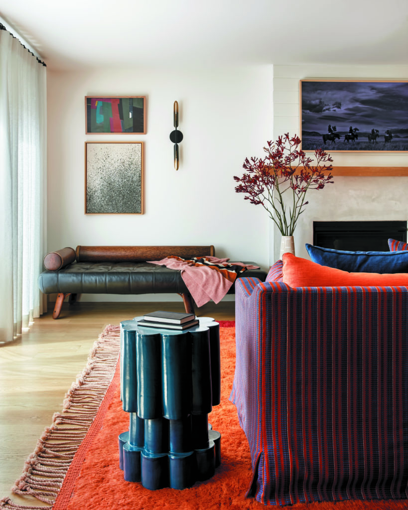
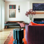
The media room, accessed by another doorway off the dining room, also pulls its hues from that central room’s wallpaper. A distinctive orange rug with a maroon border sets the stage. “It’s playful. It’s fun. It’s happy,” says Murphy. Here, as in the living room, it’s blue that shoulders the task of fostering calm. As orange’s opponent on the color wheel, its coolness tones down the fiery hue to a lively simmer. The use of natural materials—the chaise’s wooden bolster, the metal wall sconces, the ceramic side
table and the leather seating that punctuates the room’s corners—and the interplay of shapes act in concert to create a mix that feels inviting rather than overpowering.
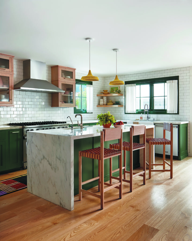
The kitchen grabs the wallpaper’s rich green as its own. “They definitely wanted a color,” says Murphy, who remembers how jarring the original black cabinets felt against the media room’s vivid orange. “We needed a cool color and we’d already used a lot of blue.” With green as the backdrop, the clients’ desire for a pop of chartreuse could be fulfilled; it’s showcased in the bright pendants that hang over the island. “Chartreuse and green are in the same color family so the effect isn’t jarring,” says Murphy. Again, texture—the woven seats of the bar stools correspond with the crocheted lampshades—and earthy materials help ground the strong hue.
Photography by Zeke Ruelas.
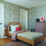
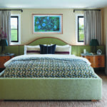
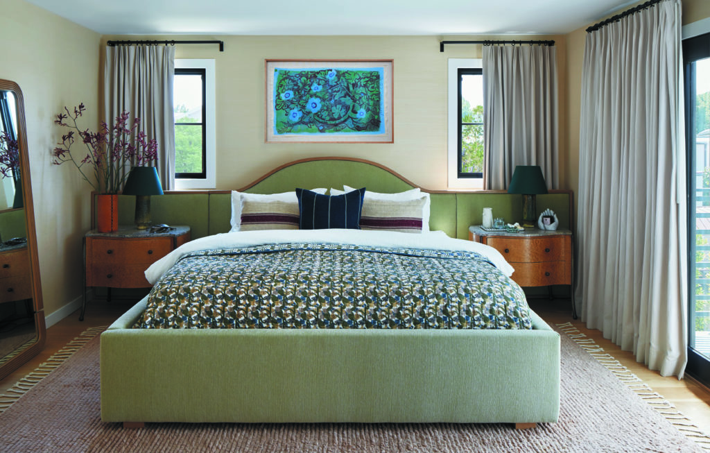
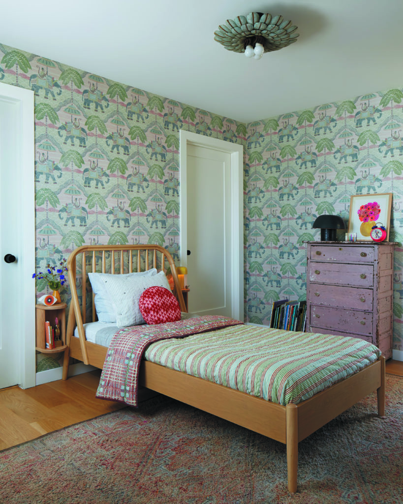
Upstairs in the bedroom, Murphy employed grayed tones, turning down the home’s lively palette to a restful flicker. In the daughter’s room, green becomes verdigris, drifting softly from the antique French ceiling light to the wallpaper. A similar color wraps the bed in the primary bedroom, dancing with blushes and mushrooms to wrap the space in relaxation. “If you can throw a lot into a home but the end result feels balanced and calm?” says Murphy. “Well, that’s a pretty neat trick as a designer.” The result is magic.
