
Color Feels
Author:Abigail StoneInterior designer Oliver M. Furth showcases his proficiency with color in this L.A. pied-à-terre

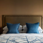
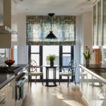
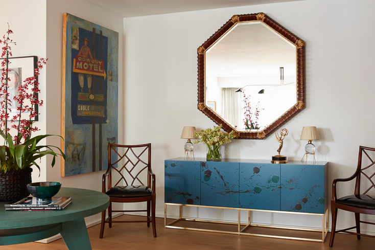
soft geometric pattern reminiscent of city blocks commissioned through Porter Teleo, is illuminated by Jason Koharik’s Folded Shell pendant. The 19th- century French mirror was discovered on 1stDibs. Photos by Roger Davies.
Color is one of an interior designer’s greatest tools—fun to play with and fun to dream about. Witness this pied-a-terre on L.A.’s Wilshire corridor that was curated by interior designer Oliver M. Furth. The space is a sophisticated haven that eloquently uses color to express the clients’ zest for family, travel and their creative, forward- thinking approach to life.
“They wanted a place that would be comfortable and welcoming. And they have grandchildren so it would need to be casual and unpretentious,” says Furth. “Our job was to enhance the existing features of the space via finishes and lighting as well as to update the entire kitchen.” While on paper, the clients skewed traditional, even conventional, that impression drops away in person. “They’re intelligent and curious people, quirky and joyful,” he shares. This juxtaposition informed his approach to the project.
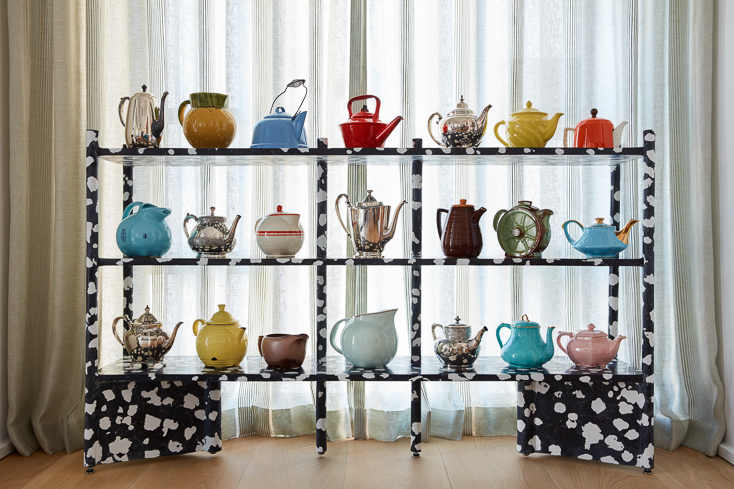
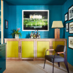
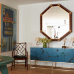
the client’s colorful collection of vintage teapots. Photos by Roger Davies.
“There’s definitely one foot firmly planted in history,” he explains. “That’s grounded in tried-and- true seating arrangements.” Antiques, culled from the couple’s previous home as well as pieces purchased for the project, underline the couple’s respect for the past. Yet given that this home represented a fresh new chapter in their lives, “they didn’t want anything stuffy or too traditional,” Furth stresses. They shared his love of color. Here it would be used to offset the vintage pieces, helping to lend vibrancy to the home. He would need to incorporate prints, a specific request from the clients. “I tend to use printed fabrics sparingly,” he says. “They can be such a focal point.”
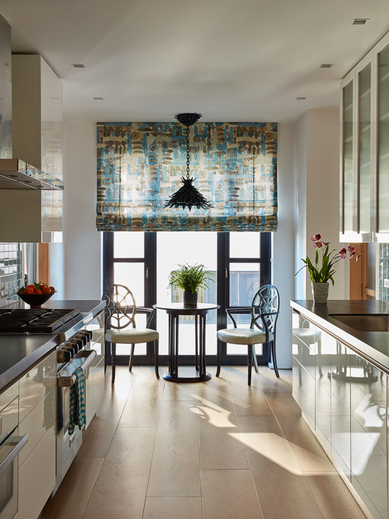
“I wanted to keep the envelope modern and appropriate,” says Furth. With that goal in mind, he replaced the space’s existing floors with wide oak board flooring, free of knots, and finished in a light tone. “Wood absorbs color, and I knew we’d use a lot of strong clear color here,” says Furth. Fussy decorative moldings were replaced by simple square casings. An awkward central column was shaved down to its most minimal size and squared off. “I wanted
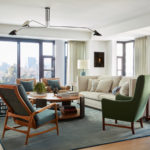
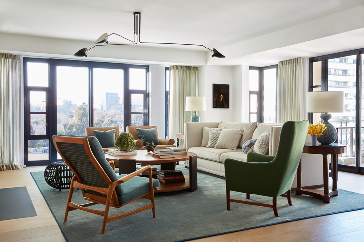
to capitalize on the great natural light in those open loft-like rooms,” Furth says of the home’s main spaces. In the living and dining rooms, he washed the walls in Farrow & Ball’s All White—a bright, warm, flat hue—and hung pale, simple window treatments. The clean stage allows the furniture, objects and artwork to sing.
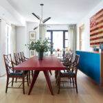
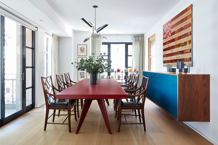
In the dining room, those joyful notes are trilled by a jubilant cow-patterned shelf that showcases the wife’s collection of tea kettles. “Because the display sits in front of a window, it needed to be open enough to let light through,” Furth explains. “We commissioned L.A.-based artist Ross Hansen to create the custom étagère. Beyond meeting our objectives for storage and display, it’s full of fun and whimsy.” The bold piece is balanced by a long lipstick red Prouve dining table and a large custom credenza with electric blue doors.
Photos by Roger Davies.
on 1stDibs. Photos by Roger Davies.
In the living room, green is the soloist. It breathes freshness into the conventional setup by corralling the seating arrangement in the center of the room. Used as upholstery, it connects the disparate pieces, including a mid-century Kofod–Larsen adjustable-back chair, a 19th-century English high-back chair, table lamps from Circa Lighting and an Albini ottoman.
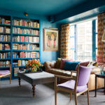
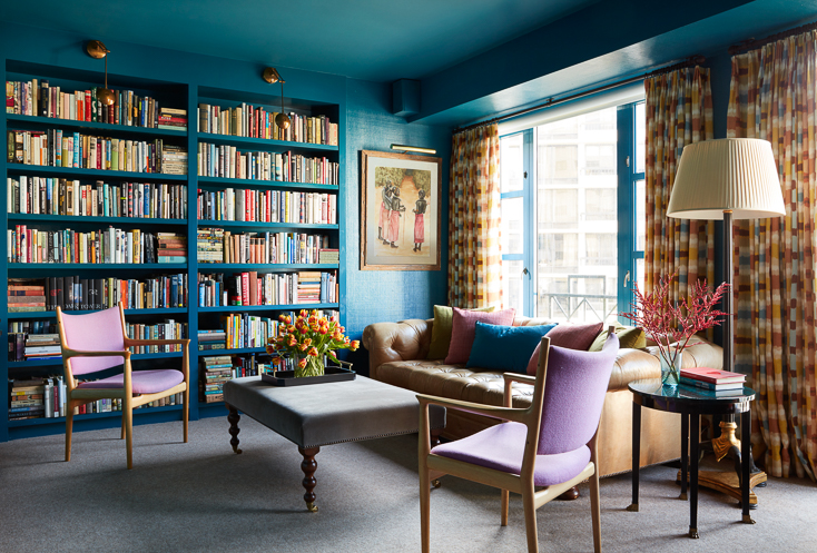
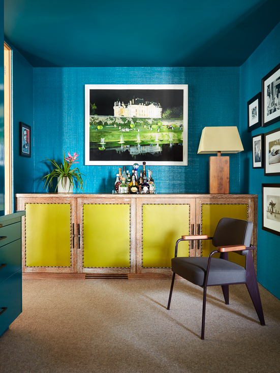
Furth underlined color’s relationship to light in the smaller spaces, including the foyer and the library, where the use of rich hues turns the mood cozy and fashions the traditional into the unexpected. In the library, that comes courtesy of teal. Madagascar cloth-covered walls and a dense wall of built-in bookshelves are lacquered in a deep version of the blue-green hybrid then glazed to a subtle gleam. Pops of orange, its complement on the color wheel, in the guise of curtains made of a patterned fabric from Cowtan & Tout, allows a pair of vintage Hans Wegner JH513 armchairs upholstered in lilac and a custom cerused oak cabinet inset with acid yellow leather panels to shine. Wall-to- wall carpeting by Tretford in gray grounds this perfectly balanced quintet of hues and confirms the room’s sense of warmth. In the foyer, the partnership of a custom table in jade green and a custom splatter-painted cabinet from Lawson-Fenning in blue dance with Porter Teleo’s “Outside the Box” wallcovering in shades of chartreuse and a ceiling in a custom teal, telegraphing the vivaciousness that will be found within this home. “Color is such an effective way to communicate a mood,” says Furth. “In this case, it sets the tone, expressing joy and playfulness.” Clear as a bell.