Keep it Simple
Author:Lindsey ShookKatie Martinez Design and Wade Design Architects prove not all design has to scream
When hired to completely overhaul this 5,000-square-foot home in San Francisco, Katie Martinez Design and Wade Design Architects were thrilled to work together, again. “This was our second project with both the clients and architects, which made the collaboration feel natural and productive,” says Katie Martinez. “I’ve always enjoyed working with these clients—they are refreshingly intelligent, straightforward and clear about what they need and want. They have a calm, sophisticated yet playful style.”
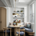
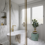
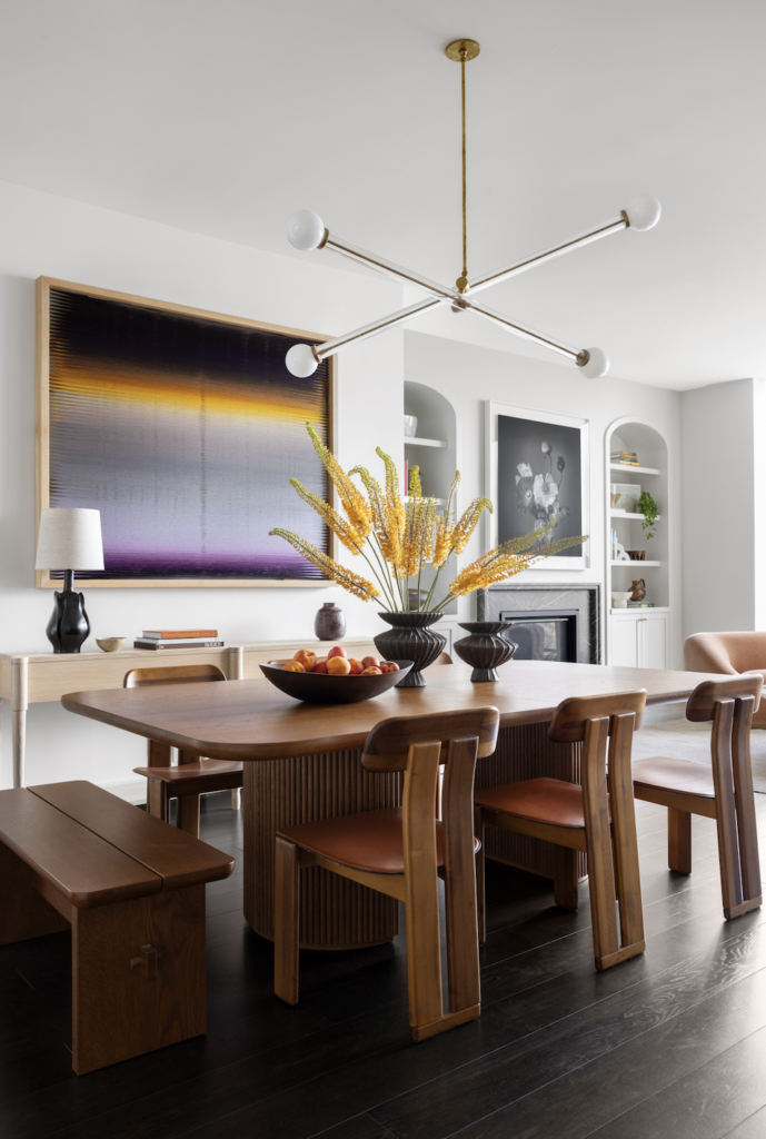
Biomorphic Pendant by Montera. Photos by Bess Friday.
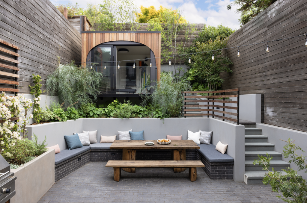
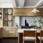
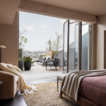
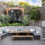
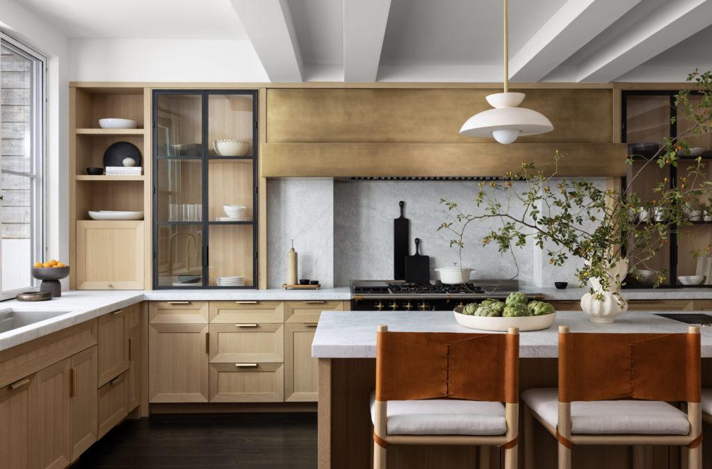
The clients enlisted Dijeau Construction to collaborate with the design teams on the reconfiguration of the home’s facade, floor plans for all five levels, a new kitchen and living spaces and a new primary suite level, in addition to all new materials, finishes and decor. “The rear garden was also reconfigured and includes the additions of an outdoor kitchen and a home gym in the very back of the property,” notes Ani Wade. “Our approach to design is to listen carefully to our clients’ desires and do a deep dive with them prior to starting work so that the end result is one that would have been created by the clients themselves if they had the skills and tools necessary to do so.”
The original structure wasn’t exactly ‘dated’ but wasn’t suitable for a modern family. “There were odd asymmetrical elements and unbalanced natural lighting,” Wade recalls. “The stairway treads were cantilevered with a glass guardrail mounted on top, all which felt cold and unsafe and our clients’ goal was to open up and connect the spaces, and make the home more inviting for their family and friends.”
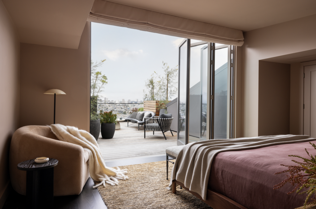
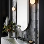
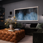
Brown Jordan, RH, Galanter & Jones and Williams Sonoma. Photos by Bess Friday.
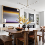
Prior to the renovation, the primary level which holds the kitchen, dining room and living room, was so open that there was no way each room could function independently. “This compromised the acoustic and visual privacy of each zone, and created a space that lacked visual interest and flow,” says Wade. The team designed a new passageway with angled walls that includes a scalloped painted wood surface, that allows the spaces to transition. “This approach was very successful at integrating the existing steps between the spaces and was the key to create both separation and aesthetic appeal without dividing the spaces with walls or doors,” Wade notes.
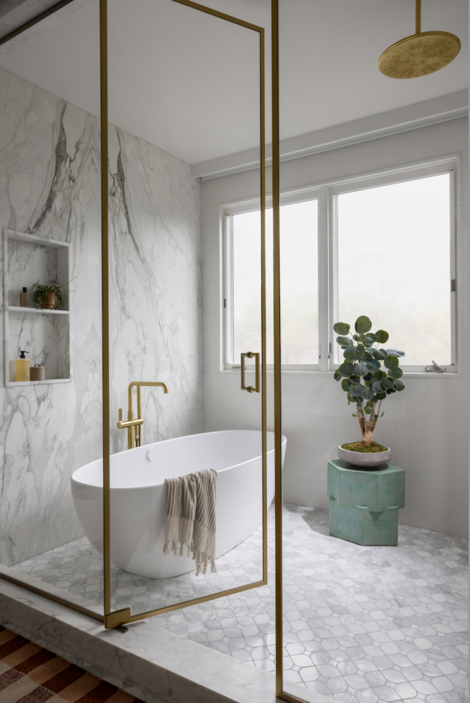
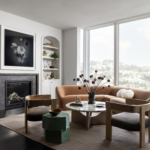
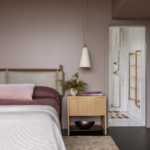
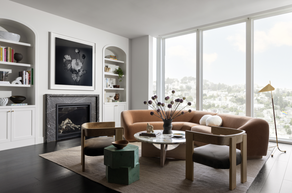
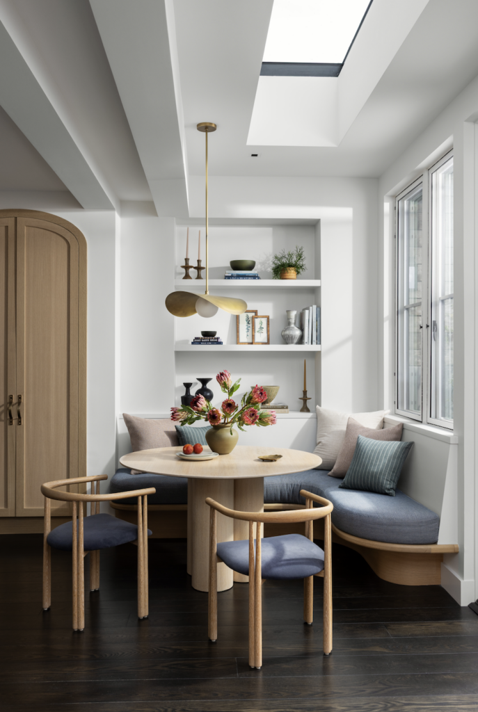
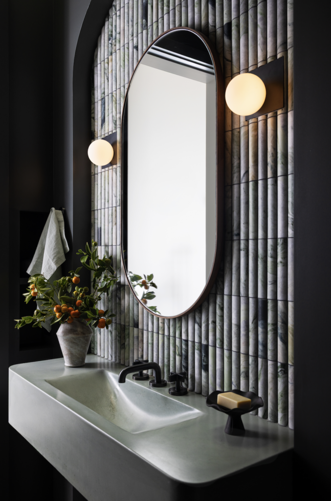
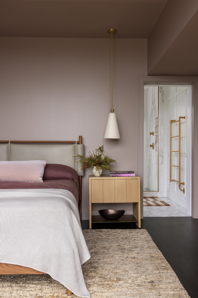
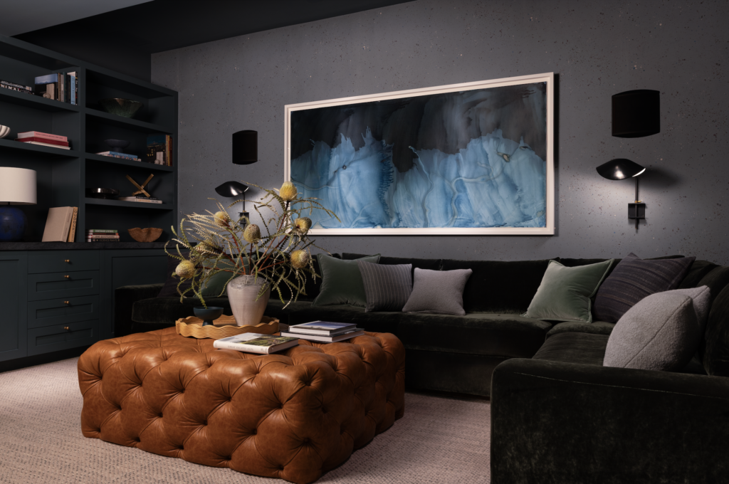
The interior selections reflect the same mission of a cohesive design that also allows for individuality. ‘We gave each space its own material palette while threading consistent colors, wood tones and stone throughout,” Martinez says. “Wade Design’s bold move to angle the kitchen, opening and shifting the material on the ‘portal’ walls creates a transition that beautifully unifies the spaces while still defining them.” They played with the concept of curves throughout on both soft and hard surfaces and worked with Caroline Brinckerhoff of CHB Art Advisory to select large-scale art with bold color and subject matter—to add a strong visual statement.
Each space is durable, stylish, tailored to the clients’ needs and offers a peaceful place for their family to connect. “As is the case with many of our projects, our clients came along with us on the discovery, design and construction processes from start to finish and so their reaction with the finished result was not one of surprise but one of satisfaction with the knowledge that they had been listened to, and their most important requirements had been met,” Wade marks.