Uncommon and Cool
Author:Lindsey ShookStudio Roene infuses a Mill Valley mid-century home with color and quirk
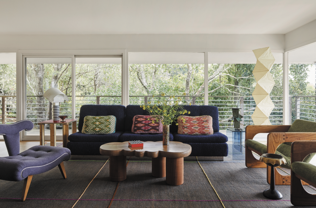
The “balance of opposites” is a leading principal at Studio Roene, a new Bay Area-based design firm helmed by Julia Sobrepeña King, who has worked with industry giants including Waldo Fernandez, Michael S. Smith, Commune and Charles De Lisle. In 2021 King decided to forge her own path and share her signature “offbeat chic” style, which is inspired by art, craft, history and culture. All of these elements are evident in the collected, cool spaces she has designed.
Photography by Angela Hau styled by Austin Whittle.
When referred by former employer Commune to assist a family in Mill Valley with the refresh of the kitchen and bathrooms inside their mid-century home, the scope quickly expanded to a revision of the entire house. “It was super important to them that the vision for the design was unique and uncommon, and by that I mean they did not want the typical farmhouse/all-beige-and-cream look that many people today tend to go for in their homes,” says King. “The vibe needed to remain relaxed and unpretentious, but they wanted to go an extra step with the playfulness.”
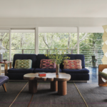
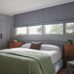
The clients and their two young sons surf a lot and are drawn to nature, so the interiors needed to feel grounded and organic. However, the wife is a well-respected art curator with a refined art collection that deserved a fun, complementary setting. “I used all of this information as a jumping-off point for the design,” King recalls. “Northern California has some of the most stunning landscapes I’ve seen, whether on the coast or inland, so creating a connection between the indoors and outdoors is always important.” She and her team focused on the existing floor-to-ceiling windows and numerous skylights as the guiding voice that the furniture and art would echo.
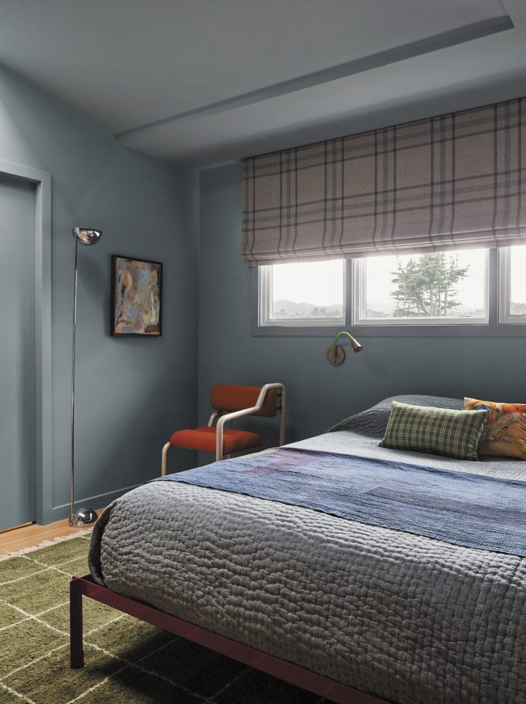
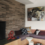
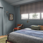
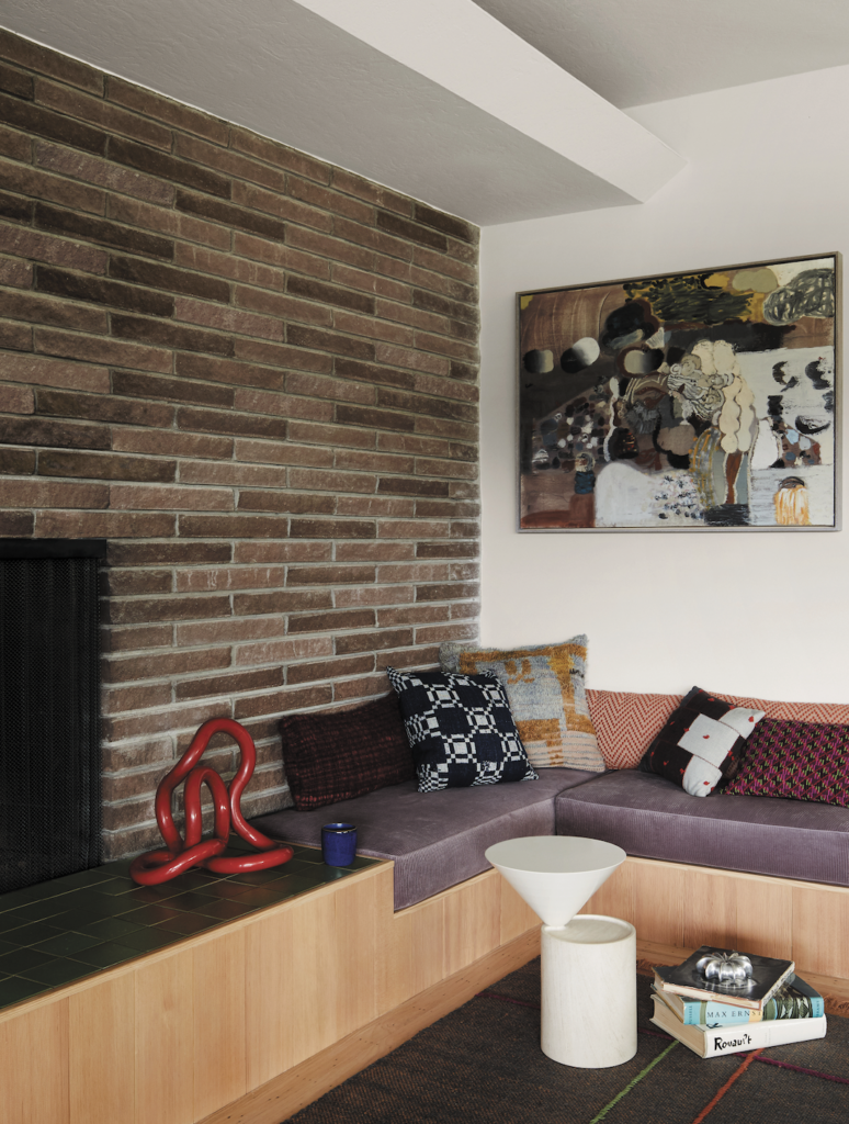
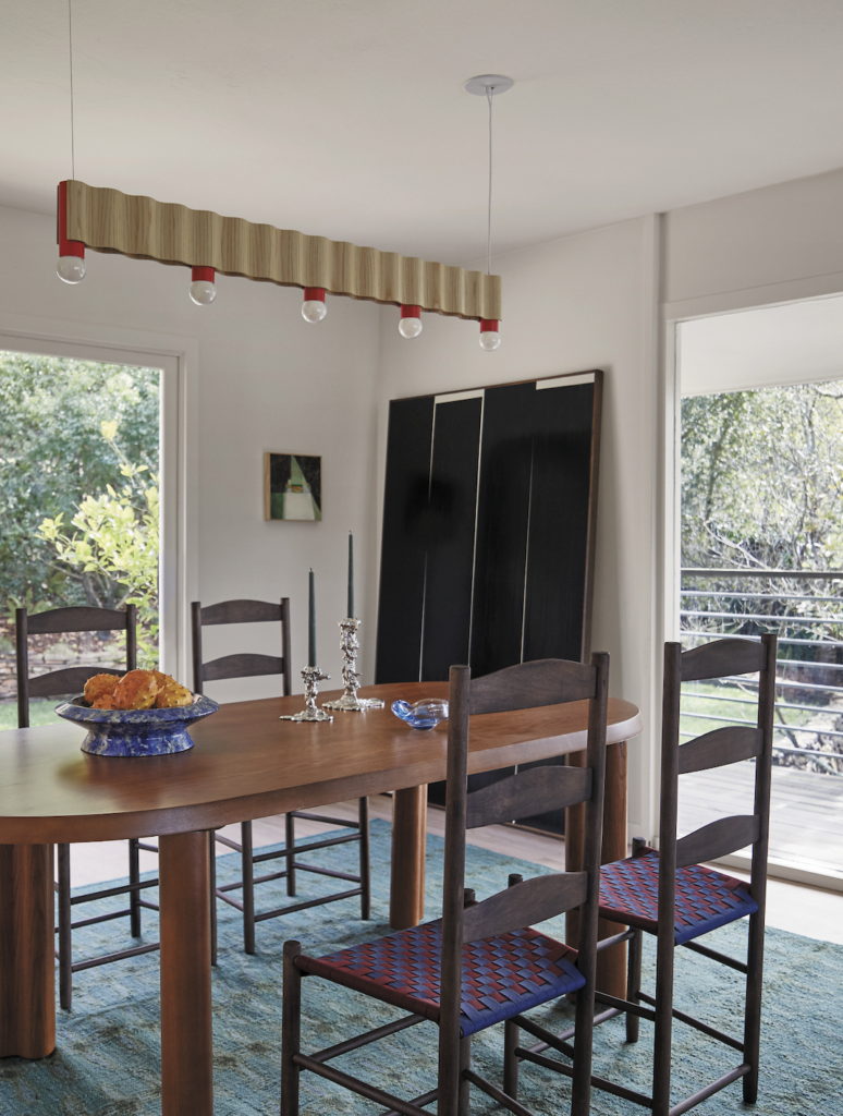
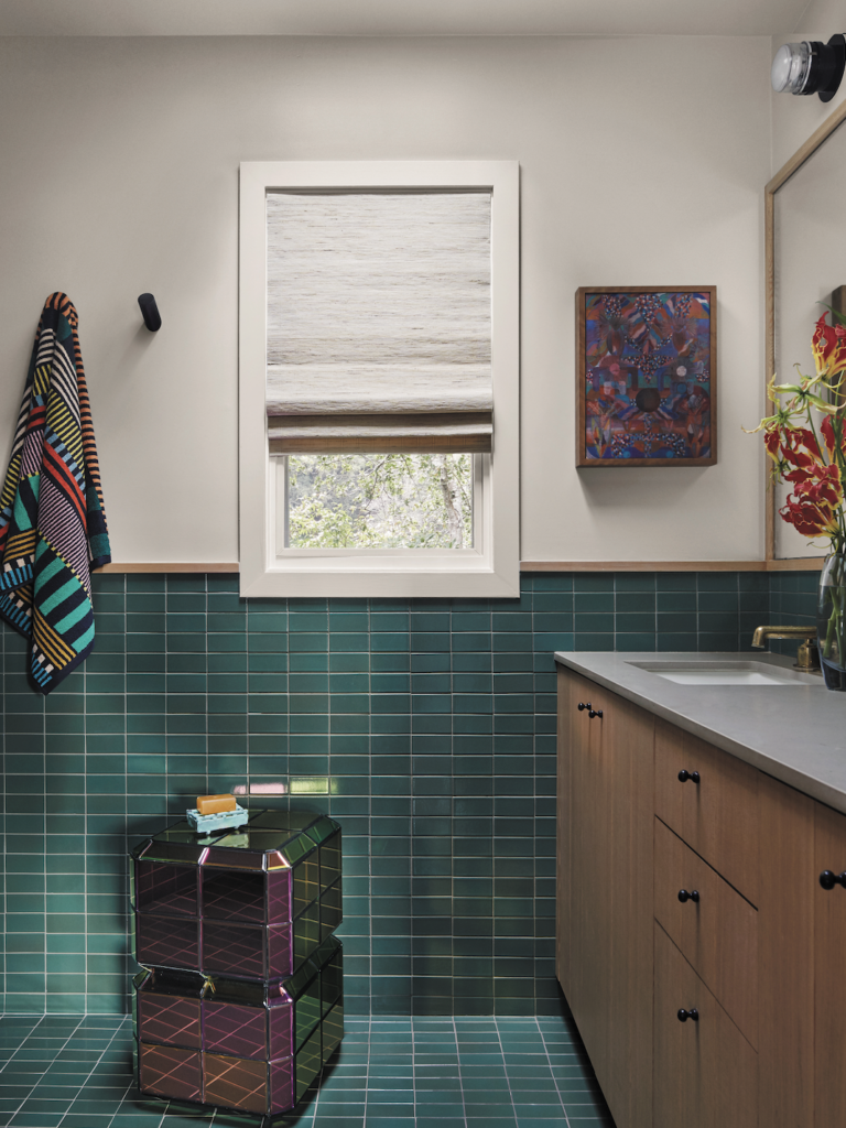
The laid-back California attitude served as an additional undertone for the project, as the team wanted the foundation to feel casual and unassuming. “We took inspiration from how Sea Ranch homes are furnished with bold colors and graphic patterns—there is an irreverent playfulness with a bit of restraint where imperfect things just perfectly come together,” King notes. “We tried to capture this spirit with the colors and materials we used throughout the house, with the greens and blues inspired by the forest and coastline, the use of waxed copper and verdigris, solid wood-clad walls and lots of plywood and earthy terra-cotta tones.”
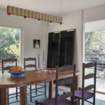
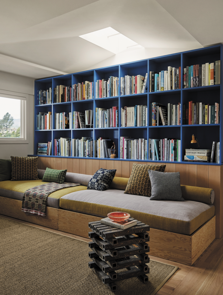
While the floorplan would remain intact, materials and finishes had to change. Like the typical Sea Ranch home, wood played a central role in this shift. King hand-selected and lined the entry, the library, the kitchen and the living room with solid vertical grain Douglas fir wood boards. “The clients wanted the wood to be very clean with minimal knots but still wanted a natural feel,” she says. “The contractor actually had to redo the boards three times until they looked perfect, but the paneling really elevated the home and gave it new life.”
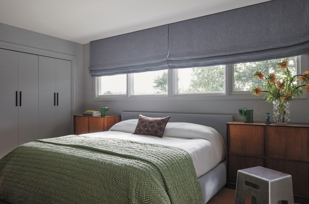
Color theory was then used strategically to transform each room in an unexpected manner while setting the stage for the client’s dynamic art collection. “They didn’t want their home to look like a madhouse, but they really wanted the ‘little bit of weird’ to shine through very subtly,” she proclaims. “In every room there is something that makes it feel a bit off”—starting in the kitchen, where one electric green leg
is holding up the island. “This was our way of bringing in some of the vibrancy from the rest of the house without overwhelming it,” she adds. “We added subtle handmade elements in the kitchen, such as the cast bronze cabinet hardware by Pruskin Hardware and the waxed copper hood that we designed and had fabricated by Vermont Metals.”
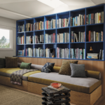
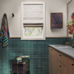
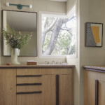
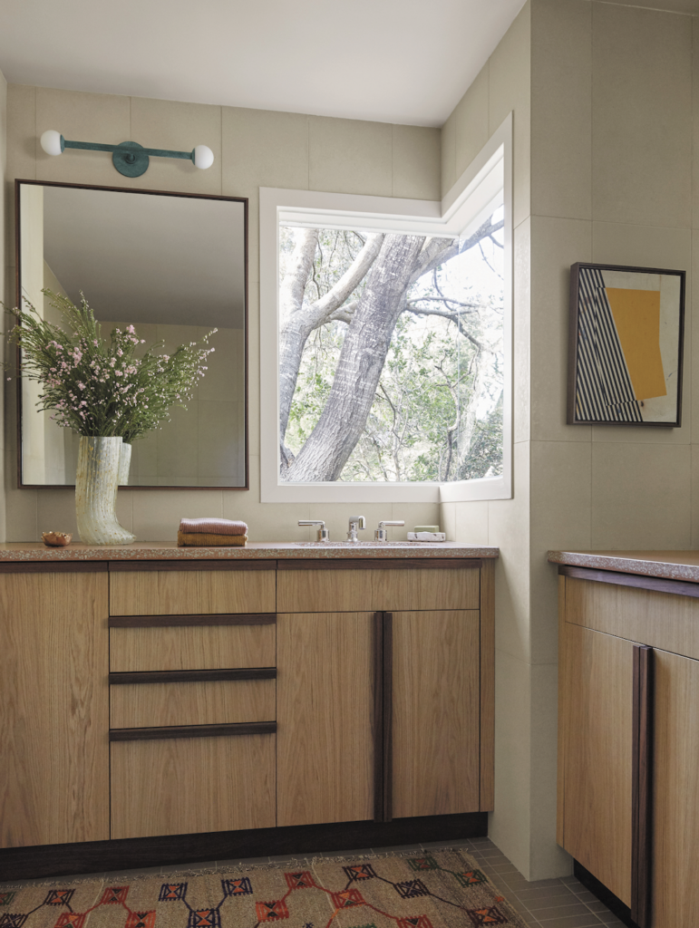
Other unanticipated details can be found in the library, where the team installed reverse color-blocked upholstery on the daybeds with faded lilac and yellow linens, while in the primary bathroom, the palette is simple and more neutral per the clients’ request. Concrete tiles were installed on the walls, a taupe Fireclay tile on the floor and terra-cotta concrete countertops are illuminated by copper patinated sconces from Allied Maker.
While the two-year completion was lengthy, it was rewarding in the end. Not only was the family thrilled with how everything came together, they were in love with how the colors and materials bring a refreshing sense of soul to the home. King worked with a number of local artisans and makers to create furniture that echoes the handmade feel of the surfaces and complement the mid-century architecture. “The layers of found objects and unexpected details we put in the house, and the time spent overanalyzing the color scheme and materials, really gave the house a unique personality,” King remarks. “The clients were very involved in the construction process from beginning to end, so they were excited to finally see it come to life.”
